Luxury Hospitality Branding
A brand-specific colour palette is a thoughtfully curated collection of colours that embodies the essence of a luxury hospitality brand. We learned this the hard way in the world of high-end resorts… From the signature navy blue and gold of The Ritz-Carlton to the soothing greens and blues of wellness-focused resorts, colour is a powerful tool in reinforcing brand identity and elevating the guest experience.
The strategic use of colour psychology plays a crucial role in creating a cohesive and immersive environment that guests instantly associate with a luxury hospitality brand. Whether it’s the calming ambience of a beachfront resort or the sophisticated elegance of an urban hotel, the considered application of specific hues across all touchpoints – from interiors to marketing materials – shapes the overall brand perception and emotional impact.
Selecting the right colour palette is more than just a visual choice; it’s a strategic decision that reflects a brand’s personality, values, and target audience. By understanding the psychological significance of different colours, luxury hospitality brands can evoke desired emotions and influence guest behaviour. For example, warm colours like red and yellow can stimulate excitement and energy, while cool colours like blue and green create a sense of tranquility and relaxation.
Consistent application of the brand-specific colour scheme across all design elements, from lobbies and guest rooms to restaurants and spas, helps to deliver a seamless and memorable guest journey. This visual consistency reinforces the brand’s identity, builds recognition, and elevates the perceived value of the hospitality experience.
Luxury Hospitality Marketing
Colour psychology is a powerful tool in luxury hospitality marketing, influencing both digital and print collateral. From vibrant, attention-grabbing advertising campaigns to the carefully curated imagery on the brand’s website, the strategic use of colour palettes helps to cultivate the desired emotional response and brand positioning.
When crafting content and visual messaging, luxury hospitality brands often leverage bold, saturated colours to convey a sense of energy, opulence, and exclusivity. Splashes of gold, deep reds, and jewel-toned hues are commonly used to evoke feelings of indulgence and prestige. In contrast, softer, muted tones are employed to communicate a sense of serenity and relaxation, aligning with the brand’s wellness-focused offerings.
Beyond static imagery, colour-driven advertising campaigns can further enhance the emotional impact of a luxury hospitality brand. By incorporating dynamic colour schemes, animated sequences, and sensory-rich elements, these campaigns immerse the viewer in the brand’s ethos and promise of an extraordinary guest experience.
Extending the brand’s colour palette across both digital and print marketing collateral, such as brochures, menus, and event materials, helps to forge a cohesive visual identity. This consistency reinforces brand recognition and solidifies the luxury hospitality brand’s position in the minds of discerning travellers.
Luxury Hospitality Interior Design
Masterful application of colour theory and spatial planning is essential in crafting the ideal ambience and mood within luxury hospitality environments. Whether designing a lavish hotel lobby, soothing spa, or gourmet dining venue, the strategic use of colour can significantly enhance the sensory experience and guest satisfaction.
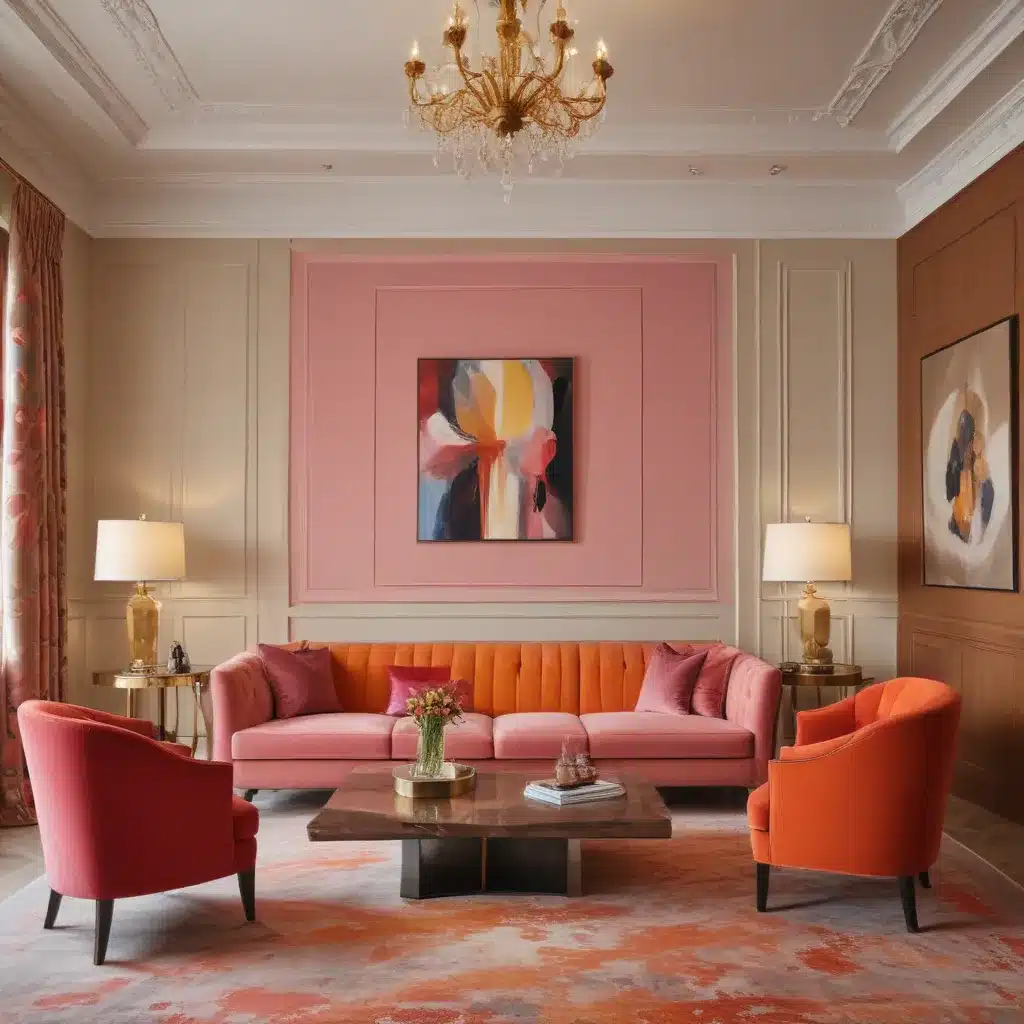
By understanding the psychological impact of different hues, interior designers can strategically employ colour schemes to evoke specific emotions and set the desired tone. Warm, vibrant colours like reds and oranges can stimulate energy and appetite in dining areas, while cooler shades of blue and green create a sense of tranquility and relaxation in wellness spaces.
Balancing bold and subtle colours is key to achieving visual harmony and functionality. Vibrant accent colours can add visual interest and excitement, while neutral tones provide a calming, sophisticated backdrop. This strategic use of colour contrast helps to highlight key architectural features, guide the guest’s focus, and craft a cohesive, immersive atmosphere.
Integrating colour with lighting, textures, and materials further enhances the sensory experience. The interplay of colour, light, and materiality can dramatically influence a guest’s perception of temperature, acoustics, and overall comfort. By carefully orchestrating these multisensory elements, luxury hospitality designers can craft truly memorable and impactful environments.
Memorable Guest Journeys
Colour psychology plays a pivotal role in shaping guest expectations and experiences within luxury hospitality settings. From the first impressions of the lobby to the soothing ambience of a spa treatment, the strategic use of colour can guide the guest’s emotional state and enhance their overall satisfaction.
In the lobby, vibrant, eye-catching colours can create a lively, welcoming atmosphere, while softer hues promote a sense of tranquility and relaxation. Thoughtful colour selections in this critical first touchpoint set the tone for the entire guest experience and shape their anticipation of the luxury hospitality brand.
Within wellness and spa environments, the integration of nature-inspired greens and blues can foster a deep sense of calm and rejuvenation. Leveraging the psychological impact of these colours, luxury resort spas and wellness centres can craft serene, restorative sanctuaries that transport guests to a state of pure relaxation.
In gourmet dining venues, the considered use of colour can heighten the guest’s sensory experience and stimulate the appetite. Warm, vibrant hues like reds and oranges have been shown to increase hunger and encourage social interaction, while cooler tones create a more relaxed atmosphere for intimate dining experiences.
By thoughtfully incorporating colour psychology throughout the guest journey, luxury hospitality brands can craft immersive, memorable experiences that exceed guest expectations and solidify their reputation for excellence. From the moment of arrival to the final farewell, the strategic use of colour becomes a powerful tool in elevating the overall guest experience and cultivating long-lasting brand loyalty.
As a leading hospitality consultant, I encourage luxury resorts and spas to embrace the power of colour psychology in their branding, marketing, interior design, and guest experience strategies. By understanding the emotional impact of specific hues and orchestrating them in a cohesive, multisensory manner, you can elevate your brand, captivate your guests, and deliver unforgettable hospitality experiences. To learn more about how The Landing Resort & Spa can implement these colour-driven strategies, I welcome you to reach out and schedule a consultation.
Example: South Lake Tahoe Luxury Retreat 2024

